
The Weight of Italic Calligraphy and the Time I Almost Burned the House Down

I once nearly burned down my family’s home cooking steaks.
I grew up broiling them with aluminum foil. That’s just what we did. So when I slid them under the broiler in a newer model oven and saw sparks flying, I wasn’t immediately alarmed. I kept asking the man of the house at the time if it was going to be okay. He was immersed in a football game and assured me it was.
Until it wasn’t.
By the time the firemen left, the oven looked like it belonged in a scrap heap. There was no saving it.
Fortunately, the damage was contained to the oven. The house was intact. Everyone was fine. I, however, was left with lingering jitters and a very healthy respect for fire alarms.
To this day, I’ve never attempted to broil another steak.
And I never forgot the feeling of realizing something permanent could have been lost because I assumed familiarity meant control.
Fast forward to this winter.
I found myself standing over another surface that allowed for no mistakes.
A mat board.
The Odessa Fire Company reached out about completing the next entries on a permanent piece listing their past chiefs and presidents. The original calligraphy had been completed by Delaware’s own Riva Brown of Living Letters Studio—a calligrapher and watercolor artist whose career spanned nearly five decades before her recent retirement.
Follow behind a calligrapher with nearly 50 years of experience?
Sure. No pressure.
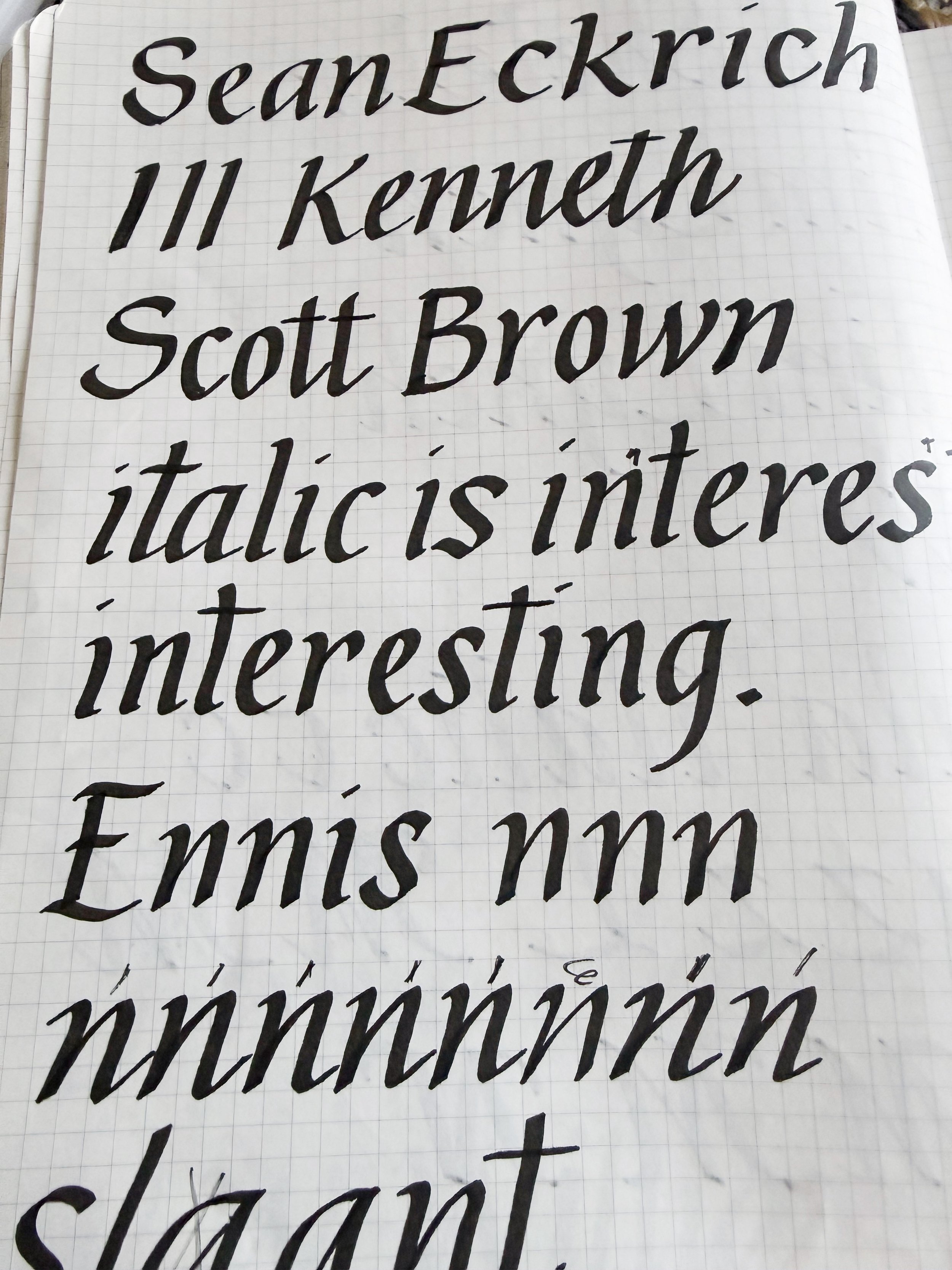
The script was Italic. Not stiff textbook Italic. Riva’s hand carried ease. Confidence. A rhythm that comes from decades of muscle memory. She moved in and out of formal and casual elements without making a show of it.
Learning Italic is one thing.
Learning someone’s hand is quite another.
And this was mat board.
No erasing.
No lifting.
No “let me just fix that real quick.”
Just ink and permanence.
So I did what I always do when I’m out of my depth.
I researched.
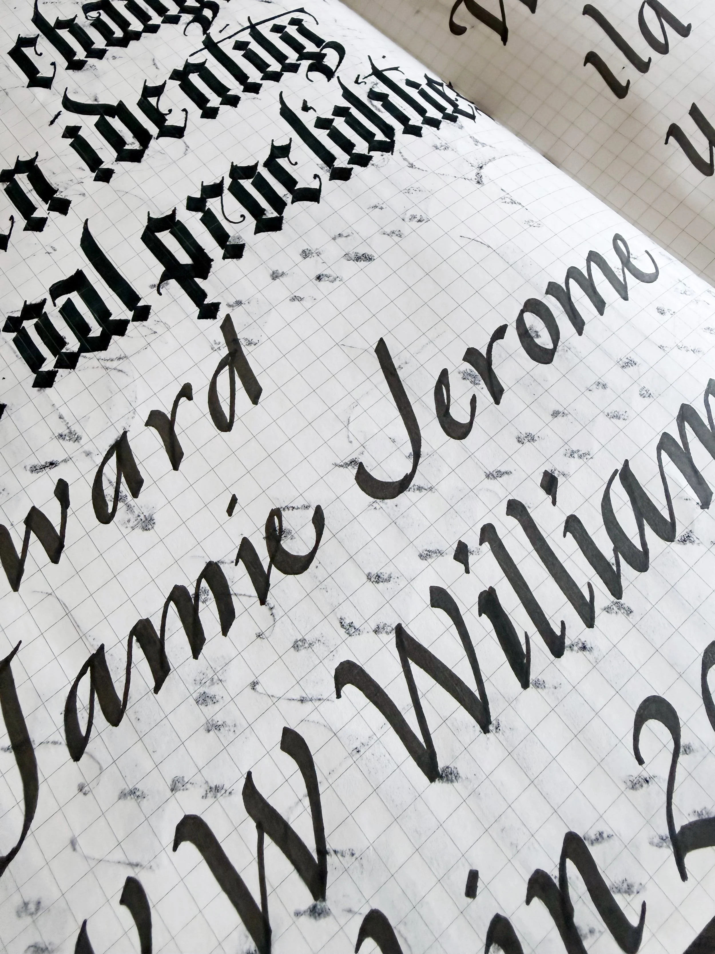
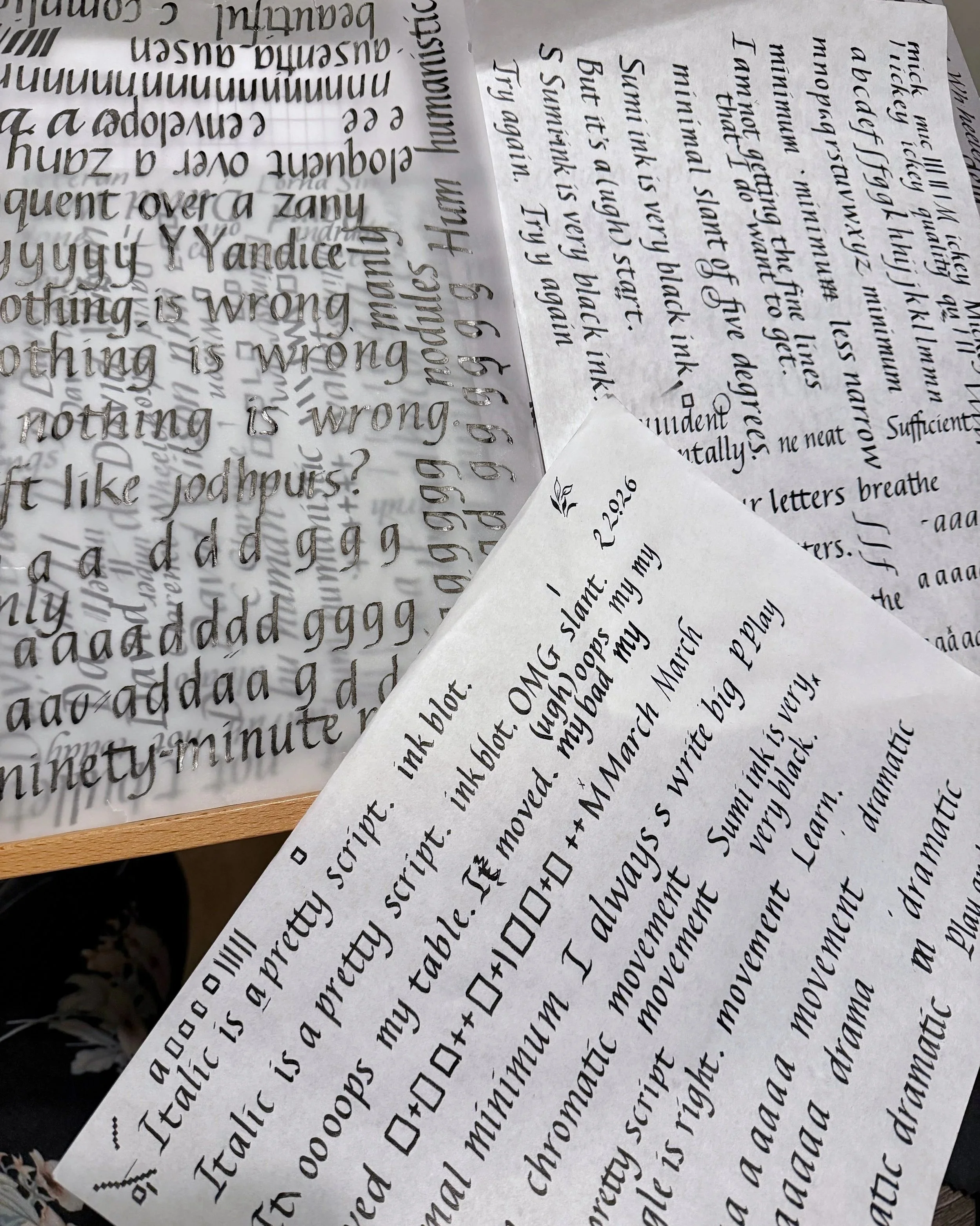
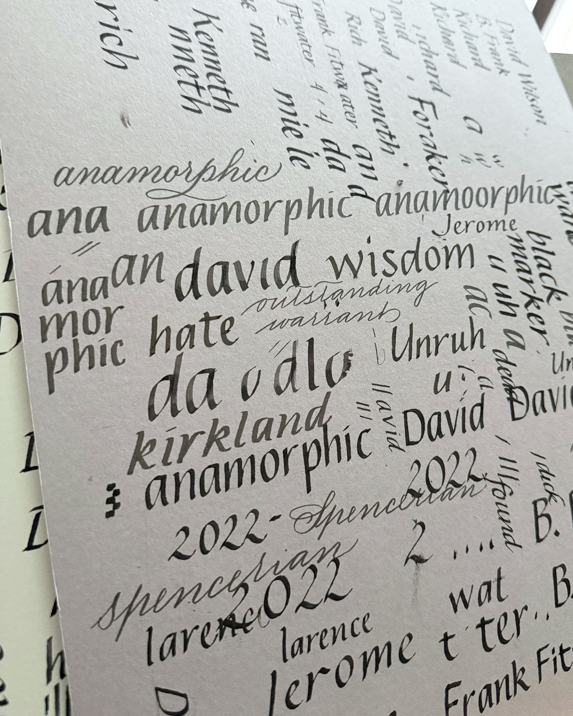
YouTube videos. Books from ThriftBooks. Notes. Practice sheets. More practice sheets. I learned the difference between formal, casual, and cursive Italic. I sharpened nibs with an Arkansas stone because apparently that’s a thing...and because I was going through broad-edge nibs like they were disposable spoons.
And can we talk about maintaining a five-degree slant with a forty-five-degree pen angle? That is not for the faint of heart. Crosses and squares filled pages of practice paper while I tried to keep myself honest.
But practice paper forgives you.
Mat board does not.
In between all that, I asked other calligraphers what inks would behave on mat board because this was a one-shot situation.
No do-overs.
No room for error.
Plenty of room for terror.
One of the quiet gifts Riva left behind was a small horizontal mark at the bottom edge of the board—a clue to how she tested the ink she had used.
There’s something sacred about that kind of breadcrumb.
Armed with scrap mat boards from Jerry’s Artarama and several ink tests, I finally found a combination that worked.
Meanwhile, the board stayed locked in my office. I live with my disabled adult daughter, and let’s just say I don’t leave permanent ink projects unattended during waking hours. So much of this was done in small windows after she fell asleep. When the house was quiet. When permanence felt louder.
For the first week after I learned the basics of Italic, I didn’t write anything on the board at all.
I just looked at it.
I took photos so I could study the way she formed certain letters while I was out and about. I paid attention to her spacing. Her joins. The way she used or didn’t use serifs in certain combinations.
Marrying formal and casual elements and making it all cohesive? Even as a calligrapher of only four or five years, I can tell you: that’s not easy to do.

I even found myself thinking about how signature forgers study writing upside down to better see the shapes. Not because I had any plans of forgery, of course. Just because I was desperate to understand the structure beneath her rhythm.
When I finally began, I could feel it in my shoulders.
Pressure.
Not panic. Not fear.
Just the awareness that what I was about to write would outlive me.
Each name represents years of service. Late-night calls. Leadership. Brotherhood. Families who trusted someone to show up when things were on fire.
The least I could do was make sure the next names belonged.
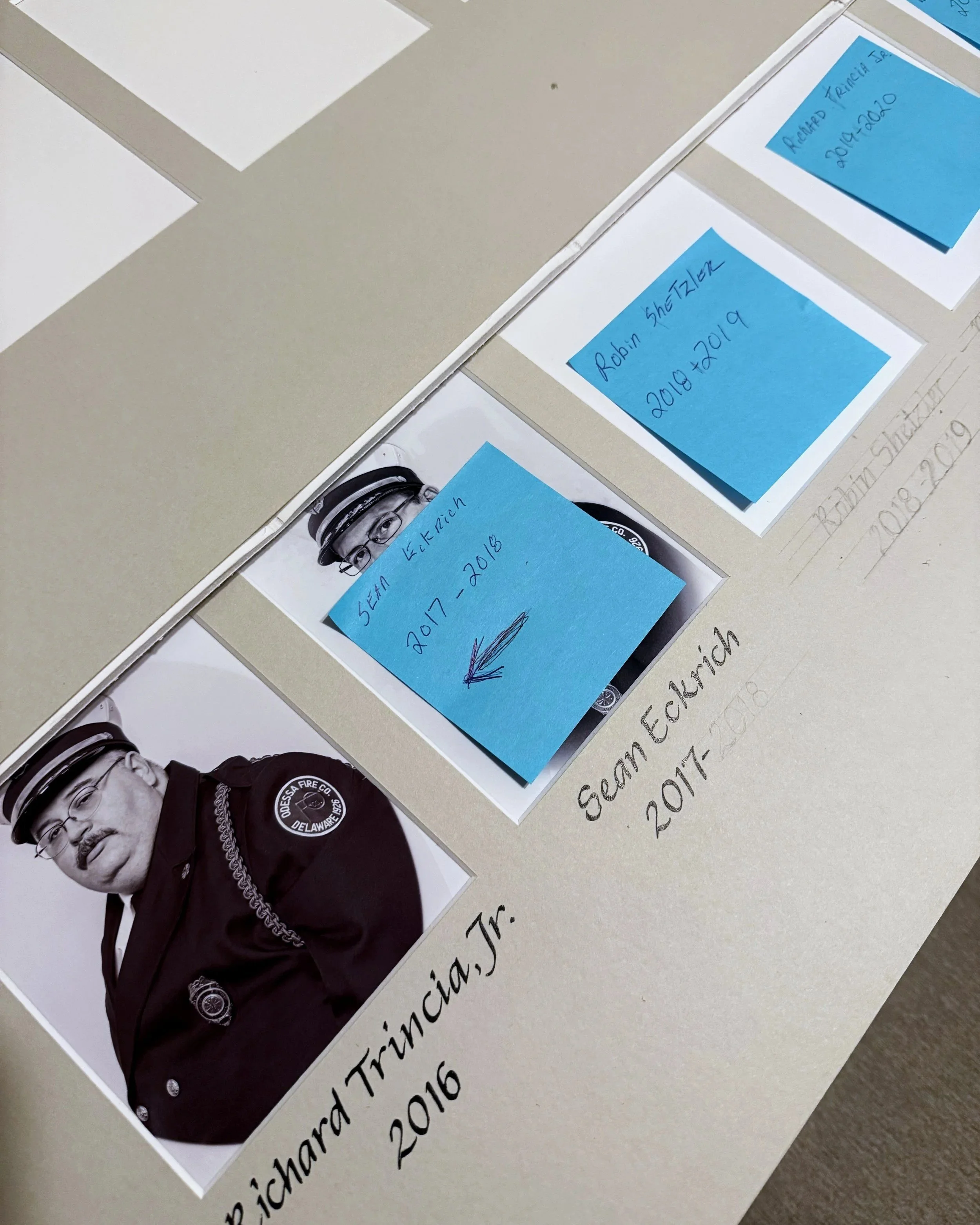
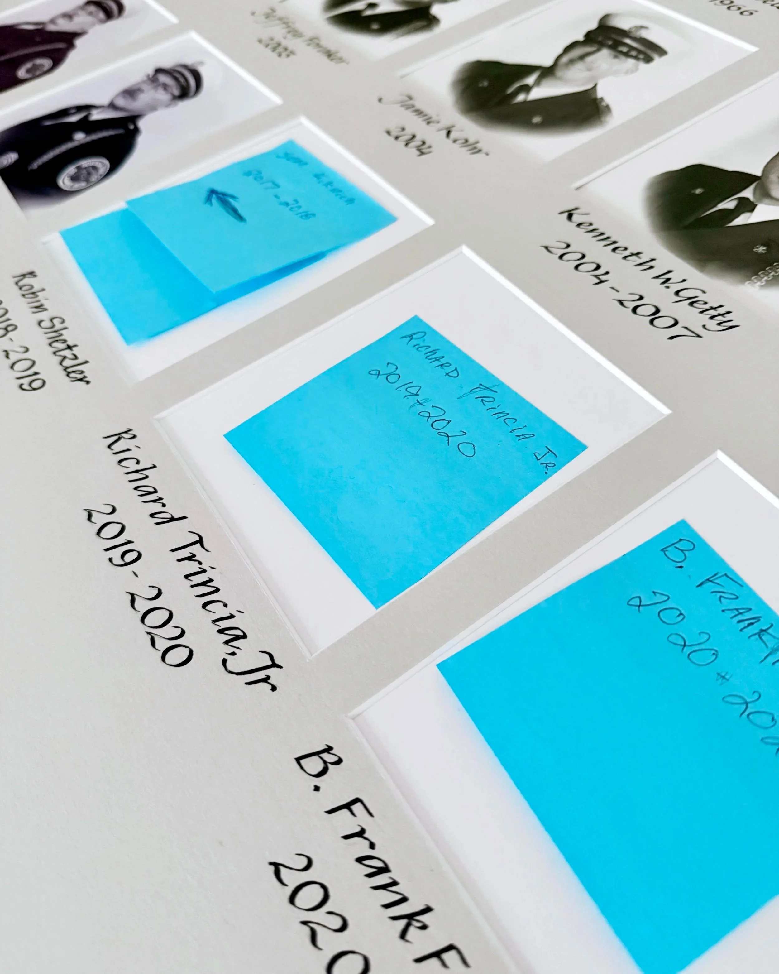
I didn’t duplicate her hand perfectly. I couldn’t. Her teardrop tittles over the i’s, for example, are distinctly hers. My muscle memory prefers something closer to a dash. And trying too hard to imitate what isn’t yours can create a different kind of mistake.
So I learned just enough to continue the flow.
To quiet my own voice.
To respect hers.
To let the piece remain cohesive.
In a time when creatives are constantly told to differentiate, to brand, to leave a signature mark, this project required the opposite.
It required restraint.
It required honoring a legacy rather than promoting my own. And it was definitely an honor to be entrusted with continuing a piece that will serve this community for decades to come.
And maybe that’s why it felt so heavy. Because when the ink touched that mat board, there was no undoing it.
Just like that oven.
Sometimes permanence changes the weight of your hand.
And sometimes the pressure you feel isn’t a warning. It’s simply proof that the work matters.
Whether I’m adding a name to a permanent board or personalizing something in real time at a live event, the responsibility feels the same.
Care first.
Craft second.
Ego never.
Thank you, Ms. Riva Brown.
And thank you to the firefighters of Odessa Fire Company for your years of service.
— A newer Delaware calligrapher with a healthy respect for fire and the people who answer the call